The Munro logotype is a confident and refined custom typeface, with a visual connection to the logomarque ‘peak’ in the construction of the letters M and N. The angles highlighted in the ink traps are suggestive of the peaks and troughs of mountains, and how they mimic financial performance data.

Download logo

The Munro logomarque 'peak' is a nod to the brand namesake, the Scottish Munros, as well as suggesting an upwards direction; the long-term goal being onwards and upwards for growth investing. Whenever the logomarque ‘peak’ is used, it should match the scale of whatever size the Munro logotype is used in the same piece of collateral (it will be the same size as the flipped shape in the middle of the letter M). The logomarque ‘peak’ should never be rotated, always appearing to be pointing up.
Download icon

Clear space is the minimum space required around the logo. This is to maintain visibility and legibility at all times.
The clear space is the same for the logotype and the logomarque ‘peak’: x2 of the width of the first stem (vertical bar) of the letter M, with the slight adjustment of x1.75 on the right hand side of the logotype (next to the letter O) to balance the negative space.
When the logo is highlighted with a colour-blocked background (the ‘BASE COLOUR’ of the logo), the colour blocking should be determined at least by the minimum clear space (it can have more breathing space, just not less).


In general, it is preferred that the logotype and logomarque peak will not be locked up together horizontally (side by side). Instead there are various lockups that can be used together that emphasise the dynamics of the brand, whether the logotype and logomarque are only used in isolation (i.e one on front, one on back), or creating movement with placement away from each other, but in a considered way. The way the lockups are arranged are based on the underlying ‘annual’ grid, suggesting timeframes of the financial year (see LOGO USAGE & BRAND GRID).

PREFERRED (separate)

PREFERRED (separate)

NOT PREFERRED (together)

PREFERRED (separate)

PREFERRED (separate)

NOT PREFERRED (together)
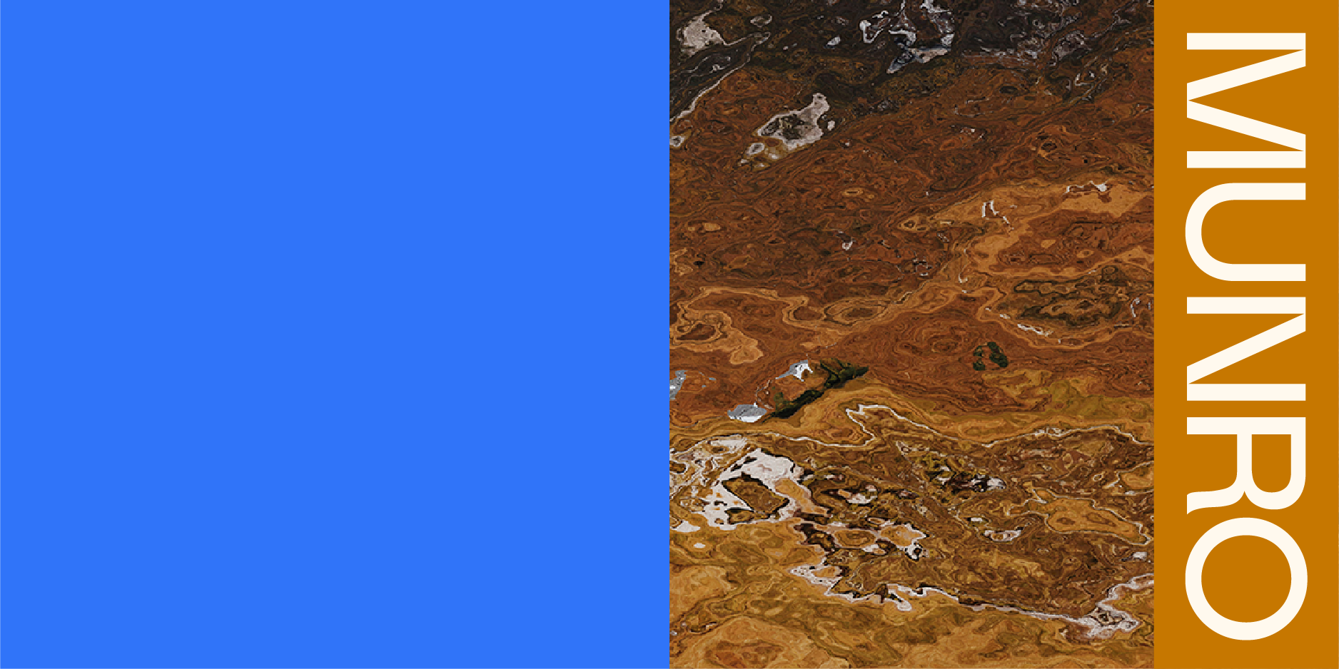
The underlying ‘annual’ grid (suggesting timeframes of the financial year) generally breaks the available space into 2 (‘6 month’ sections, using the brand imagery and solid colour), and then in half again (‘3 month’ sections, where headline text can be positioned, the baseline sitting on the centre line). This is best demonstrated with the various Munro covers i.e Powerpoint, Quarterly, Fund Fact Sheets, YouTube videos.
The ideal application of the logotype on this grid is for the horizontal dimensions to fill the section (keeping at least minimum clear space in mind) whether imagery or block colour, and positioned either horizontally or at –90 degrees. The logotype can sit at the bottom or right hand side of the section (it is never left-aligned), and on occasion, at the top (this is mostly when it is a smaller application, for example as a header in the Powerpoint or as a smaller logo on he YouTube covers). When rotated –90 degrees the letter M should be at the top, never the letter O.
When the logotype is highlighted with a colour-blocked background (the ‘BASE COLOUR’ of the logo), again the colour blocking size should be determined by at least the minimum clear space, and the horizontal dimensions of the logotype + colour-blocked area are to fill the section.


The orientation of the logotype + colour-blocked area should produce intersections, rather than multiple horizontal/vertical layers, when combined with background colours and imagery, see examples of portrait and landscape preferred layouts. The exception is when there is no background imagery, for example on the letterhead and Powerpoint slides.


PREFERRED


NOT TO BE USED


PREFERRED


PREFERRED
PREFERRED
PREFERRED
The orientation of the logotype + colour-blocked area should produce intersections, rather than multiple horizontal/vertical layers, when combined with background colours and imagery, see examples of portrait and landscape preferred layouts. The exception is when there is no background imagery, for example on the letterhead and Powerpoint slides.

PREFERRED


PREFERRED

PREFERRED

PREFERRED

NOT PREFERRED
NOT TO BE USED

PREFERRED

PREFERRED

NOT PREFERRED

NOT TO BE USED


PREFERRED


PREFERRED
A difference in rules between the logotype and logomarque: generally the logomarque 'peak' will be aligned to the right (keeping clear space in mind), however in isolation, it can be aligned to the left (for example on the backs of the business cards). Whereas the logotype is never aligned to the left.


In general, the preferred ACCENT COLOUR* of the logo is either OAT or PEAT, depending on the background imagery or colour (whichever is most legible).When a BASE COLOUR* is used, for general use, the preferred colour combination is BASE COLOUR (YELLOW) + ACCENT COLOUR (PEAT).
*ACCENT COLOUR = the logo colour
*BASE COLOUR = the colour-blocked background of the logo
See colour palette


For profile pictures this is the preferred usage, and should be the –90 degree rotated version, either aligned to the right (starting with the M at the top) or centred within the space (this application works best if the profile picture is cropped to a circle). Smaller iterations (i.e favicons or smaller profile pictures) can be the Munro 'peak' in PEAT on a YELLOW background, centred.
The Munro logo can be used in the other brand palette colours, but there are some strict correlating rules (see COLOUR & IMAGERY RULES) depending on what background or BASE COLOUR is used. The preferred hierarchy of use is illustrated here: PRIMARY, SECONDARY and TERTIARY. It is rare that the Munro logo will be in BLACK or WHITE (monotone) in branded communication, but is available if third-party communication requires it.


Primary


Secondary


Tertiary

Any time the Munro logo is used in reference to Canada (i.e for their LinkedIn, YouTube accounts etc) its preferred usage is with BASE COLOUR (PEAT) + ACCENT COLOUR (SKYE).

Primary


Secondary


Tertiary


