The supporting brand typography and its usage is clean and structured to hero the more intricate Munro imagery, suggesting confidence and efficiency in the way Munro operates, as well as ensuring communication is clear.
The colour of Munro typography should always be PEAT where possible, and where hierarchy required, 50% PEAT can be used to differentiate. Occasionally an added colour from the brand palette may be used to highlight, for example to signify hyperlinks.

Download fonts
These are the set typography styles in use across Munro branded collateral, specifically in InDesign templates. Character styles generally only apply as an addition to body copy.
The colour of Munro typography should always be PEAT where possible, and where hierarchy required, 50% PEAT can be used to differentiate. Occasionally an added colour from the brand palette may be used to highlight, for example to signify hyperlinks.

Clarity – a catch all for simplicity and transparency – is the ingredient behind Munro’s success, so should be the aim for any design layout.
Colour blocking is used to bring interest and clarity to layouts; the negative space complementing the more detailed visualisations and allowing room for type to breathe.
Again, the underlying ‘annual’ grid is used as a guide here (suggesting timeframes of the financial year). It generally breaks the available space into 2 (‘6 month’ sections) and then sometimes in half again (‘3 month’ sections).


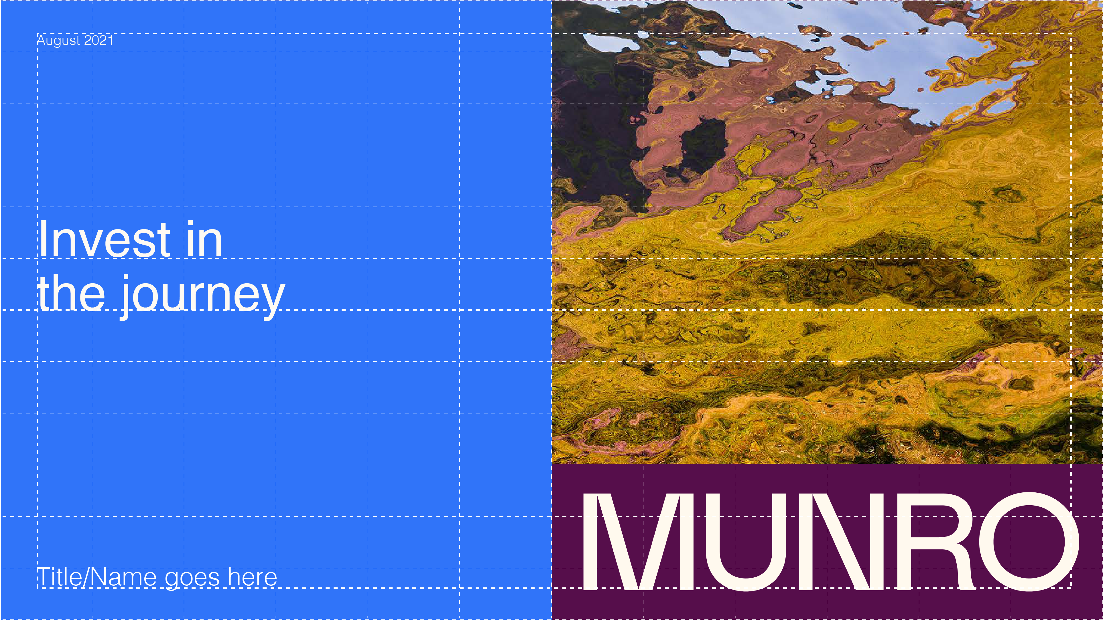
Portrait document covers are split in half, utilising the top half for the coinciding visualisation and logo, and the bottom half in the appropriate CATEGORY COLOUR* houses the text.
*CATEGORY COLOUR = the overall background colour associated with the different categories of the business, such as funds and AOIs (see COLOUR/IMAGERY RULES).
Seen here fund = PINE and AOI = SKYE.
The main heading within the CATEGORY COLOUR should always be left-aligned to the document margin, and the baseline grounded to the horizontal centre line (not just centring the section of text in general). It is important that headings do not go over 3 lines as they will not fit within the space.
Landscape document covers are also split in half, utilising the right hand side for the coinciding visualisation and logo, and the left hand side in the appropriate CATEGORY COLOUR to house the text. This layout can also be used for video overlays, showing information on the left side that can slide away to reveal the footage. If there is no appropriate CATEGORY COLOUR, OAT is the preferred background colour.
Again, the main heading within the CATEGORY COLOUR should always be left-aligned to the document margin, and the baseline grounded to the horizontal centre line (not just centring the section of text in general). It is important that headings do not go over 3 lines as they will not fit within the space.
When it comes to more text-heavy layouts (especially A4 documents) the Munro grid extends further to make use of every ‘month’ - so horizontally and vertically divisible by 12. These gridlines can be used as guides to align sections of text.
Vertical strips of colour on the right hand side of the page are used to signify certain documents, visually representing the amount of time in a year on the grid for the Monthly report (1/12) and Quarterly report (1/4) with the relevant fund colour combination. Then the Fund Fact Sheet is an even 1/2 split with the allocated fund colours. The top colour should always be the same colour as the accent fund colour, and the bottom colour should always be the base fund colour (see COLOUR/IMAGERY RULES).
For landscape-format presentations such as the Powerpoint presentation, horizontal strips of colour are used as header highlighters on each page. The colour used should correlate to the chapter's category colour for easy navigation throughout the document.
Horizontal panels can also be used in video formats to assist legibility of title blocks or subtitles.
The Munro palette is inspired by the colours of the Scottish highlands; earthy browns, verdant greens, hints of sky with accents of native flora, and retaining yellow from the original Munro brand for heritage as well as vibrancy; a sophisticated but fresh and contemporary palette.
The brand palette naturally complements every visualisation as all the colours are taken from nature, just like the photos.
The overarching Munro background colour (to act as a blank but warm canvas) is OAT; white is to be avoided when possible. For most documents 75% OAT is used to keep things light and bright. If printing, an off-white paper stock is preferred, COLORPLAN NATURAL WHITE 135gsm is preferred (or heavier).
The colour of Munro typography should always be PEAT where possible, and where hierarchy required, 50% PEAT can be used to differentiate. Occasionally an added colour from the brand palette may be used to highlight, for example to signify hyperlinks.
Tints of the Munro palette can be used when the main colours may be too vivid, for example when using as a background highlight colour or in tables when text needs to be legible over the top.
Peat
HEX #3F322A
RGB 63 50 42
PMS BLACK 5 UP / 438 C
CMYK 49 65 64 41
HEX #958F8B
HEX #CEC7BD
HEX #E1DBD2
HEX #EBE5DB
Oat
HEX #FFF9EE
RGB 255 249 238
PMS 9285 U / C
CMYK 0 2 5 0
HEX #FFFAF2
Skye
HEX #BFEBFE
RGB 191 235 254
PMS 9440 U / C
CMYK 22 0 9 0
HEX #DFF5FE
HEX #effaff
Thistle
HEX #A56EFF
RGB 165 110 255
PMS 928 U / C
CMYK n/a
HEX #D2B6FF
HEX #e8dbff
Gorse
HEX #C67700
RGB 198 119 0
PMS 138 U / C
CMYK 2 39 98 7
HEX #E2BB80
HEX #f1ddbf
Pine
HEX #004E4E
RGB 0 78 78
PMS 329 U / C
CMYK 100 3 56 18
HEX #80A6A6
HEX #bfd3d3
Munro Yellow
HEX #FEED5A
RGB 254 237 90
PMS 101 U / C
CMYK 0 0 93 0
HEX #FEF6AC
HEX #fffad6
Heather
HEX #560E4B
RGB 86 14 75
PMS 255 U / 7652 C
CMYK 47 90 4 13
HEX #AA86A5
HEX #d5c3d2
Loch
HEX #3074F9
RGB 48 116 249
PMS 2727 U / C
CMYK n/a
HEX #97B9FC
HEX #cbdcfd
The abstract Munro brand imagery is created with photography of Munro mountains and Scottish landscapes, manipulated through movements informed by performance data; a unique interpretation of mountainous landscapes, without being simply landscape photographs. The peaks and troughs are part of the journey, just like bagging Munros.
Using data from the performance of the Munro funds (whether +/–), the visualisations are beautifully animated in an upwards or downwards trajectory when used digitally (on the website, in videos etc), bringing a new perspective and forward-thinking attitude to financial services, whilst maintaining the association with the rugged Scottish landscape.
These visualisations allow flexibility for the Munro brand language, with both 2D and animated graphics achievable with unlimited scope for variation to keep branded collateral exciting moving forward, by simply selecting new photography to apply the visualisation to.
The best results are achieved with landscape photography that has a distinguishable horizon (so the sky and land divide the image) and features vivid colours; there are a lot of dark/moody/dreary photos of the Scottish highlands out there which don't always achieve the desired effect, so sourcing more vibrant and colourful photography is key.
Go to the 'editor'
Download visualisation

The Munro brand uses a combination of colour and imagery to represent different funds, areas of interest and other categories of the business, which are used across all collateral.
In general, colour combinations in Munro branded collateral will be associated with categories or funds, so will be selected from the above rules. However in the rare case of general communication where there is no associated category or fund, OAT and PEAT are the core colours for background and text, and highlights are to be in YELLOW or LOCH. If an extra added colour is required, PINE is preferred (as it represents the core product - funds - but also as a shade of green it suggests nature and therefore the Munros). As a last resort, a supplementary colour can be chosen from the brand palette to best suit the corresponding visualisation or photograph (if using).
Please note incorrect usage of colour pairings (these colours should not be used together due to poor legibility).
PRIMARY PAIRINGS

SECONDARY PAIRINGS

TERTIARY PAIRINGS

Icons are used to add visual stimulus for all Munro AOIs, as well as other key themes and messages in branded collateral. The Munro icons are predominantly from feathericons.com with several custom additions.
Download icons


Download icons


When the Munro visualisations are not used as imagery, photography can also be utilised. Some general rules for selecting photography:Photography subjects should reflect the topic they are required to represent, but not in a crude or obvious 'stock photo' way.
For free images UNSPLASH is a great resource, and many of their available photos have a softened focus or depth of field which brings in a more refined aesthetic than many harsh stock photos.
Photography colouring should be somewhat soft and with tones from nature, to ensure it sits well alongside any of the Munro visualisations, as well has having a warm undertone, so it fits in with OAT as the general background colour. Photos that are more desaturated than vivid full-colour are preferred, and featuring hints of the brand palette; predominantly blue/orange/yellow tones.
Download images


-p-1600.jpg)


Tables are to be clean and simple with no background (or 75% OAT as the background document colour) and if need be, only the heading row differentiated with a fill.In general horizontal row strokes are only used for the heading of the table which is underlined, and never use vertical column strokes.
For when more contrast is required, alternative rows can be defined by filling with a tint of PEAT.
Or to bring colour, and when connected to a particular fund or category, alternative rows can be defined by filling with a relevant colour (normally at 25% for darker colours and 50% for lighter colours).On occasion colour can be used as a fill at 100%, for example in the Powerpoint presentation.


The general use of colour for Munro graphs/charts/diagrams is simply using PEAT and its various tints.
For any axis, labels or legends this should be 100% PEAT to match Munro typography. Then the visualised data can be in tints of PEAT. This is for clarity and consistency. It also allows for any additional imagery/logos that may be required in the graph/chart/diagram to have a clean base, so as not to be busy or overwhelming, and further colour will be injected into the layout via use of header (Powerpoint), side strip colour bar (Monthly, Quarterly, Fund Fact Sheet) or other tables.
Where relevant, graphs/charts/diagrams can incorporate their corresponding fund or area of interest colours, but in general this will just be to highlight key information, and PEAT will be the predominant colour.
If not related to a particular fund or area of interest, the highlighter colour should be LOCH or YELLOW.
However when required, and especially when circular (pie chart/Venn) diagrams are used in more isolation (i.e in the Monthly and Fund Fact Sheet), a combination of colours and tints of colours from the brand palette can be incorporated for an added splash of vibrancy. If using this approach, each colour should be easily distinguished from the next.
Microsoft themes have been created to assign the Munro brand colours and typography to Microsoft Office files. Please note especially in Excel, the application of graphs and charts are somewhat randomised, but if manually editing, these general rules apply.